Final Prototype (ArmCoach)
Final Concept
 ArmCoach_Thesis
the appendix is shared by request (approx. 80mb)

ArmCoach
motivating arm rehabilitation in daily life
Introduction
In Switzerland over 16’000 people suffer a stroke each year. The most common problem is a one sided paralysis of the body. Rehabilitation can take a very long time and requires enormous amounts of discipline and endurance. To achieve improvement the affected parts need to be moved daily which requires a great deal of effort. In particular the impaired arm is often neglected in everyday life. As a consequence the rehabilitation process takes much longer.
ArmCoach
motivating arm rehabilitation in daily life
The focus of the ArmCoach project is on motivating the integration of the impaired arm in daily routine. The project contains three important parts:
1. A bracelet for daily motivation of the patient.
2. A computer application for longtime motivation.
3. A therapist application for therapeutic support.
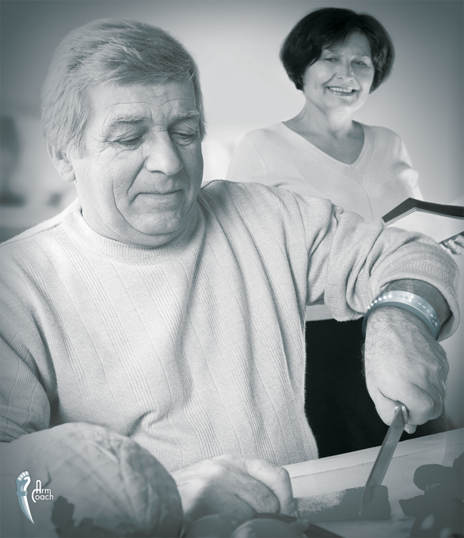
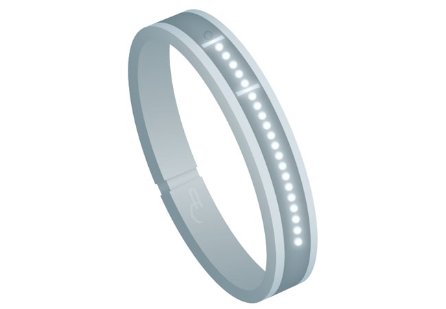
The bracelet
The bracelet is worn on the impaired arm throughout the day. It measures the movement of the user to remind him by vibration that he is neglecting the arm. By moving the arm the patient can fill in an indicator on the bracelet. The indicator needs to be filled in each day. At a certain indicator level the patient gets points for the computer application. Once in a while the bracelet needs to be connected to the personal computer in order to transfer the movement data and the points.
The patient application
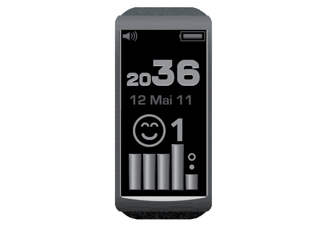
With these gathered points the patient can acquire practical tips on arm exercises for everyday activities. This motivates the patient to integrate those exercises in their daily routines. The patient can see an overview of his activities with the ArmCoach movement statistic display. The therapists are a necessary part of the ArmCoach system because they carry out the individual adjustments, and provide support and guidance for patients.
Refining Aesthetic Aspects
Bracelet
 v1
v1
All users first impressions from the watch sketch were positive. They liked the sportive and non-medical look. The implemented smiley was also very well accepted. They liked the emotional and clearly understandable feedback of it. After a discussion with our mentors about the watch they said that they can’t imagine that an eighty year old women would wear it all day long. This reason prompted us to do a second sketch.
 v2
v2
This sketch differs to the first sketch insofar as it has been opened to new ideas. The two additional components (watch and smiley) are again implemented. The smiley, daily target and perfect state are singled out. The feel and look are based on elegance and plainness. Discussing the new sketch at length we found that the more clear-cut it became the better the users were responding to it. So we deleted all additional visible components in favour of the basic ones.
 v3
v3
The final design contains the progress bar which represents the movement and the daily target as well as the Very Well status. The shape has been reduced to bracelet-size. The color is chosen to be unflashy and to blend in well with clothes.
Screens
The insight that we got from our end-consumer tests (please look at earlier blog entry) led us to make the whole look and feel experience brighter. The fonts had to be bigger too. We also decided to change the experimental shape to a better known square grid. The new size will be 1280 x 1024px. As main colour we take a color mixture between green and blue (R 0, G 112, B 126) in different saturations. Additionally we use white and black. Our chosen font is DINOT light in the sizes of 18pt for text and regular 21pt for titles and buttons. The buttons are shaped with shadows to generate an impression that they are clickable.