Service Experience (Gruppe 4)
Service Experience
INITIAL VARIATIONS //
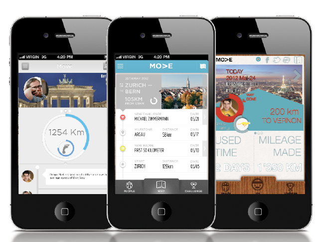
Given the concept brief we created three separate graphic concepts for the Move app. The concepts each came out looking very different and ranging from minimalist to maximalist in design.
An element that was predominant was the circle in all our designs. Which we all related to as being perfect for displaying distances traveled. Possibly purely because it was a beautiful shape to work with and looked good on the map background that we had to include being a travel companion application.
The circle also lent itself well for the challenge. By making the full circle the full distance that two users raced to complete.
The problem with the app prototypes is explained at length in the next section.
PROBLEM 1 //
Our Mentor, Stefano Vanotti wasnt quite sure if the virtual path, challenges and badges was enough to keep the attention of the users and motivate them to use the application. Most times, the mentors suggested we add something else to the equation to spice things up or add another dimension to the application. Through badges and information tidbits the user gets a small motivation to continue until the next large milestone or virtual city. By adding something else our focus would shift from being about movement to being about places. Morphing our application to a virtual travel app as apposed to being purely about logging distances. Naturally, we wanted to stick as much to our initial concept as possible and thus, chose to stick with the initial concept withought adding any more.
We are confident that the combination of creating a virtual path, gathering badges and unlocking information. As well as comparing and challenging friends is more than enough to keep a user interested.
PROBLEM 2 //
Looking at our concept screens we had a problem differentiating between the real world and our virtual world. Because our app created a virtual path it was important to visually split the two worlds apart in the design language so that the user knows that he/she is creating a virtual route and not a route that is generated on an actual map.
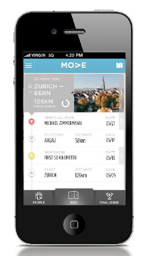
This was also relevant in the design. As you see with the following screen it doesnt look all to playful. Looks very rigid and clean something one would expect from a travel app or a distance app. We realized through input from mentors that cities written like Zurich-Bern reminds someone of a travel app.
We had to break away from those stigmas and go back to designing the interface so that it underlined the fact that the user was on a virtual path.
PROBLEM 3 //
All through our designs we used the circles as the predominant shape to show movement. It was a great contrast to the map and thus found its way in all our designs. The problem is that a circle isnt very fitting when showing a path. Because a circle is infinite and a path has a beginning and an end. So in the spirit of killing your babies we put the circle to rest and headed back to the drawing board to draw up new designs. Trying to consolidate the map and challenge view into one screen. Something that we managed to do quickly. The final screens show a simpler interface that still manages to house all the information we had shown before. But cleanly and ore inuitive since we tied everything to your path which doubles as a timeline. Simple. Intuitive. We are very pleased with the final screen concept.